Examples of Conversions Optimization (A/B Test): Home Page, Price Page, CTAs, Banners
October 16, 2024
A/B testing (also called split testing) – A technique to test two versions of a website or app, to determine which is the better one. If you randomize how it presents to users, then you can see if it's useful to know what design, messaging or feature makes them convert better.

In this blog, we discuss some of the ways in which we implemented A/B testing for home pages, pricing pages, CTAs, and banner ads to deliver massive improvements in conversion, cost per click (CPC) and overall user satisfaction. Let's dive into each important space and explain in detail with actual examples and data.
Page Optimization: Making a Great First Conversion
Your home page is your brand storefront online. A slight alteration in design, layout, and content will go a long way towards user retention and conversion. We see this with 2 big A/B tests conducted on the homepage.
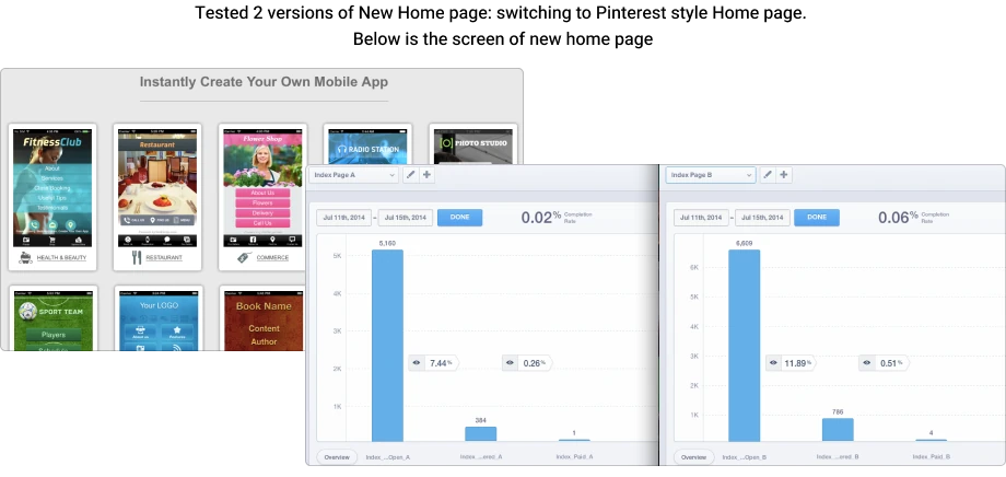
Test 1: Pinterest Home Page vs. Classic Layout
Among these tests was to redesign the homepage to look Pinterest-like. The new format was a visual, primarily user-centric layout, somewhat similar to Pinterest's card system where blocks of content are tiled.
- DisplaysThe original layout (Page A) was quite regular grid-style and it was just the text and pictures. The Pinterest homepage (Page B) introduced oversized animated images and dynamic scrolling.
- OutcomesIt tested the new home page and the conversion rate jumped 60% (11.89% vs 7.44%). That was because users got more captivated by the interactive content and were able to navigate through products and features visually better.
- ChartAs you can see on the bar chart between Page A (7.44%) and Page B (11.89%) conversions, the 60% increase in conversions is testament to the efficacy of visually based design solutions.
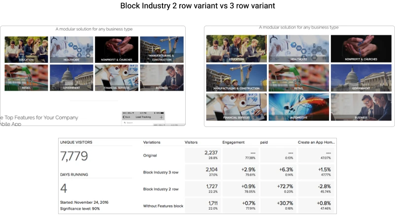
Test 2: Add Industry Block & Remove Features Block
Another A/B experiment consisted of presenting an "Industry block" with 2 rows of industry solutions and omitting a features block, describing the product functionality.
- DisplaysThe brand new homepage (Variant B) contained a segment that represented which industries the product caters to (i.e "Healthcare," "Finance," "Education"), while the previous version (Variant A) addressed product characteristics (speed, security, customization).
- ImpactWhen we added the Industry block, the paid conversions showed a 72.3% rise. Further, removing the features block led to a 30.7% higher paid conversions. The Industry block contextualized the product value for site visitors coming from different industries, while taking out the features portion simplified the process of cognitive clutter and freed users to think about making a purchase.
- Pie chartA linear chart that shows how paid conversion rate increases with time: version A's conversion rate stays around 10% and version B's jumps up to 30%, which shows the long-term value of creating industry-targeted content.
Pricing Page Optimization: Clear and Clear to More Conversions
Pricing page is the one place people choose whether or not to continue with paying. A/B testing allows companies to hone in on pricing information to get maximum transactions.
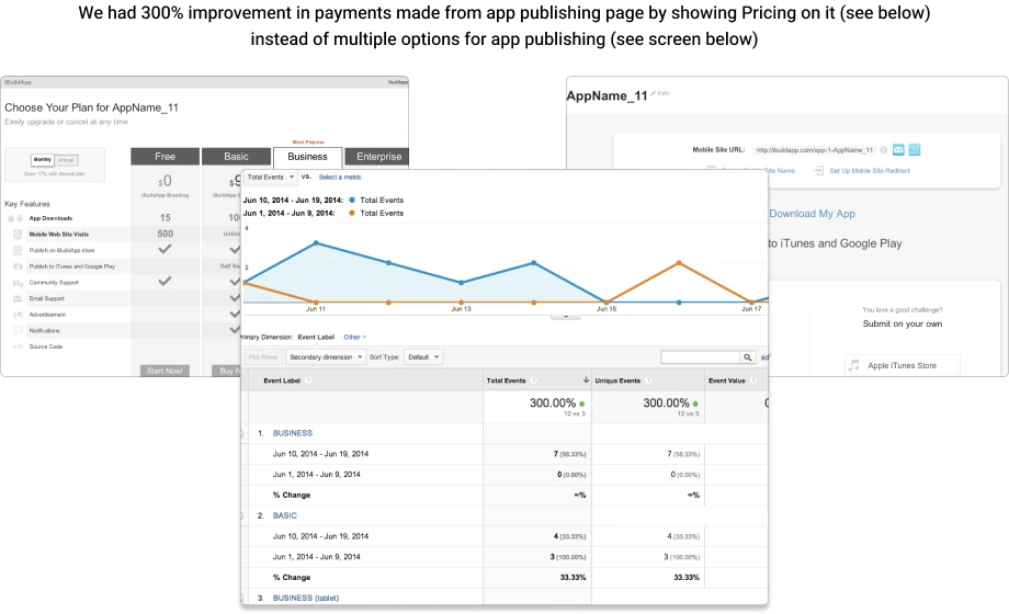
Test 1: Streamlining the App Publishing Page
When tested on the app publishing page, various app publishing buttons were replaced with direct price data. This enabled 300% higher payments.
- DisplaysThe first screen had several publishing options, jarring users and making them think through several alternatives. It came with detailed pricing, making the decision process easier.
- OutcomesClear pricing on the publishing page meant less confusion and headache, and greatly increased payments received through the platform.
- PlotColumn Screen — The 3x increase in payments on the stripped down pricing page compared to the multi-option one.
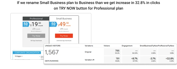
Test 2: Naming Pricing Plans
On another test, changing the "Small Business" plan to "Business" made clicks on the "Try Now" button on the "Professional" plan 32.8% more effective. This move was to change the user experience and make the pricing model seem more appropriate for businesses in all sizes rather than small companies.
- DisplaysThe original pricing page (Variant A) had "Personal," "Small Business" and "Professional," and in the newer version (Variant B), the "Small Business" plan was renamed as "Business".
- ImpactThe subtle rebranding of pricing categories actually helped drive traffic to the more expensive plan, resulting in more clicks.
- ScreenBar chart of number of clicks on the "Try Now" button for the Professional plan (after changing the Small Business level to Business).
Optimisation of CTA: Writing the Right Calls to Action
CTAs are one of the most valuable things on any web page, yet they're not often taken advantage of. By A/B testing different CTA language, images, and placements you can get big converts.
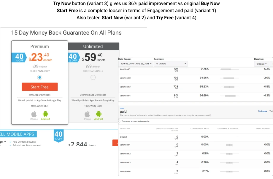
Test 1: "Try Now" vs. "Buy Now"
The switch from "Buy Now" to "Try Now" in a pricing page translated to a 36% increase in paid conversions. That test also proves that giving users a less daunting, testing-based alternative drives them to proceed deeper in the funnel.
- MonitorsSo the original pricing page (Variant A) contained a CTA to "Buy Now" and the updated version (Variant B) changed it to "Try Now," meaning an uncommitted transaction.
- OutcomesThis finding was indicative that, when there was less risk, the users would take the first step toward conversion.
- ChartA conversion chart comparing both CTAs with the "Try Now" CTA having a 36 percent conversion gain compared to "Buy Now".
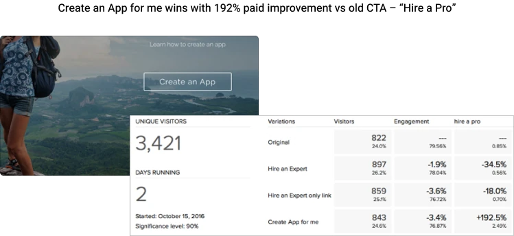
Test 2: "Design an App for Me" vs. "Get a Professional"
The change of the CTA "Hire a Pro" on the homepage to "Create an App for Me" grew paid conversions by 192%. This CTA was more practical and user-specific, beckoning users to move forward in the app-design journey.
- DisplaysOld variant (Variant A) had an expansive, unengaged CTA: "Book a Pro." The new one (Variant B) was individualized and user-centric: "Build an App for Me."
- ImpactIt is clear that this specific CTA worked much better to bring users through to the paid conversion, which is why CTAs should be more targeted.
- PlotPaid conversion bar-Screen comparing both CTAs side-by-side where the personalized CTA took a huge boost.
Ad Banners: Create CRO Ads By Designing Ads That GET PAID!
A/B testing can also be conducted on advertising banners to achieve click-through rates (CTR) and conversions.
Here are some banner A/B test examples:
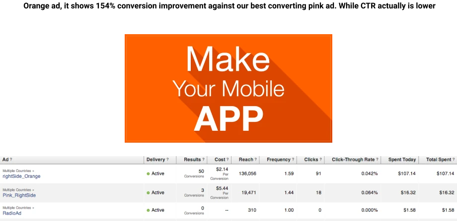
Test 1: Color Tuning
One test showed a new orange design, which was 154% more conversion-boosting than the most effective pink one, even though the orange had a slightly lower CTR. As you can see from this, CTR isn't always the best measure of ad performance (conversions are).
- LCD DisplaysThe original banner (Variant A) was pink and the second one (Variant B) was orange.
- OutcomesThe orange ad didn't click as much but it generated more sales, which means the design felt more deeply compelling.
- ChartComparison chart CTR-Conversion Rate : a comparison chart demonstrating that the orange ad did lower CTR but converted at a much higher rate.
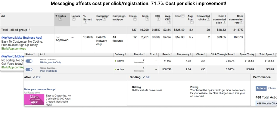
Test 2: Ad Messaging Optimization
In another experiment, modifying text on an ad banner resulted in 71.7% reduction in CPC. By making the ad copy less complex and refined, the user would naturally click through to the landing page.
- LCDsThe previous banner (Variant A) included an over-analyzed message, whereas the current banner (Variant B) included a concise message that focused on the value proposition.
- ImpactThis easier to read content lowered the price per click, so the ad campaign ran more effectively.
- ScreenAn L-spline Screen of the CPC declines for various time periods, when the ad copy is adjusted.
Conclusion: The Advantage of Continuous Testing
A/B testing is not a one-time process, but a process where the business can continuously optimize their digital presence. Making data-based choices, however, helps you optimize key performance metrics like conversion rates, engagement, and ROI. Whether that's re-working your homepage, reworking CTAs or trying out ad copy, try something new.